
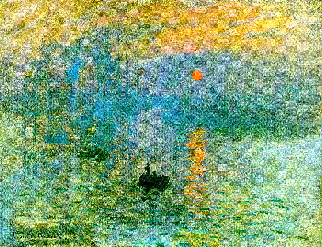
I didn't realize it until after I had finished editing, but J.M.W. Turner has fucked up my vision for life, yo. This style I did here has a lomo meets Turner meets minimal Bauhaus-inspired graphic design kinda feel to me. Compare the above to Turner's The Fighting Temeraire. The colors aren't quite the same, his are more rich while mine have a more contemporary brightness, but the style feels a lot alike. And goddamnit if that isn't all I can see now. When I first saw The Fighting Temeraire it was a major turning point in my development into a visual art lover, and then a visual artist. The brilliant, bursting color choices and the brushwork that sat somewhere between impressionism and realism but really looked different from either struck a chord with me. I realized, in Dr. Devoe the thundering, crippled professor/lumberjack's class, that I actually gave a shit about art, and "got" it. I can almost entirely blame Turner, Monet and Boccione for my interest in visual art at all (with a little Picasso and Lautrec thrown in), which is saying a little bit since, you know, that's almost half of what I spend time on now. Thus the name of this photo "J.M.W. Turner has fucked up my vision for life, yo."

No comments:
Post a Comment